Best Flutter Icon Packs in 2026

Dinko Marinac
Introduction
Flutter is slowly changing the relationship many apps have with Material and Cupertino.
For years, a lot of Flutter apps reached for Material icons without thinking too much about it. They were built in, they worked, and they were good enough for most screens. The same was true for Cupertino icons when building something more iOS-like.
But with Material and Cupertino being decoupled from the Flutter framework, I think more teams will start treating them as explicit design dependencies instead of defaults.
A mobile app should not automatically inherit its visual language from the framework. If the product has its own design system, then the icon set should be part of that system too.
This is something I recently ran into while working on a redesign for a client. We were already moving the app toward a more custom visual direction, and icons quickly became part of the same discussion. Should we stay close to Material? Should we use something more neutral like Lucide? Should we use a richer set like Phosphor? Should we generate a custom icon font?
On the web, designers often reach for icon sets like Lucide, Phosphor, Material Symbols, Remix, Font Awesome, Tabler. In Flutter, the situation is slightly different. Some of these have good Flutter packages. Some are usable, but come with tradeoffs. Some are better treated as source assets for SVGs or custom icon fonts instead of direct dependencies.
So I went through the Flutter icon ecosystem and looked at the options from a practical point of view.
Not “which one has the most icons?”
That matters, but it is not enough.
The better question is:
Which icon set can actually support a real Flutter app without making the design system inconsistent, the app bundle unnecessarily large, or the codebase harder to maintain?
What matters when choosing a Flutter icon pack
There are many small things you can compare, but I usually start with three.
1. Coverage
The first thing I look at is whether the icon set covers the product well enough.
A small icon set can look beautiful, but real apps need icons for settings, sync, filters, files, invoices, maps, cameras, charts, notifications, permissions, empty states, and sometimes very specific domain features. If the set does not cover enough of the product language, you eventually start mixing icon packs, and that usually looks worse than picking a slightly less perfect set with better coverage.
2. Tree shaking
The second thing I look at is whether the package works well with Flutter’s icon tree shaking.
Large icon sets are not automatically a problem if unused icons are removed from the release build. But dynamic lookup, string-based access, or “get icon by name” APIs can make that harder because Flutter may not know which icons are actually used.
3. Style consistency
The third thing I look at is whether the icon set fits the app’s design system.
Icons are not just small decorative assets. A Material-heavy app, a clean SaaS dashboard, a Microsoft-style enterprise app, and a custom consumer product should not necessarily use the same icon set.
Other useful things to check
After that, I also take a look at filled variants, duotone support, Figma support, licensing, and maintenance.
Filled variants are useful for selected states, especially in tabs and navigation. Duotone can be nice for empty states, onboarding, or dashboards, but most apps do not need it everywhere.
A Figma library is also useful because designers and developers can work from the same source. It also gives you a way to adjust specific icons if you need to.
Flutter icon packs worth knowing
Aside from Material Symbols, which is the obvious option if your app still wants to stay close to Google’s design language, there are a few Flutter icon packs worth knowing.
Material Symbols is probably the first thing to check if your app is already Material-heavy. It has broad coverage, supports styles like outlined, rounded, and sharp, and gives you controls like fill, weight, grade, and optical size. The main thing to remember is that it still looks and feels like Material, so it may not be the right choice if the goal is a more custom design system.
For everything else, these are the ones I would pay attention to.
Phosphor
Phosphor is one of the strongest icon sets for custom Flutter design systems.
The main reason is flexibility. It has broad coverage and supports multiple visual styles, including regular, bold, filled, and duotone icons. That gives you room to create hierarchy without leaving the same icon family.
This matters in mobile apps because selected states are everywhere. Tabs, navigation items, active filters, dashboard cards, and empty states often need slightly different visual weight. With a line-only icon set, you may eventually need to compromise or mix styles.
Phosphor is not tied to Material, Apple, Microsoft, or a very specific web-admin look. That makes it a strong option when the app is moving toward its own design system.
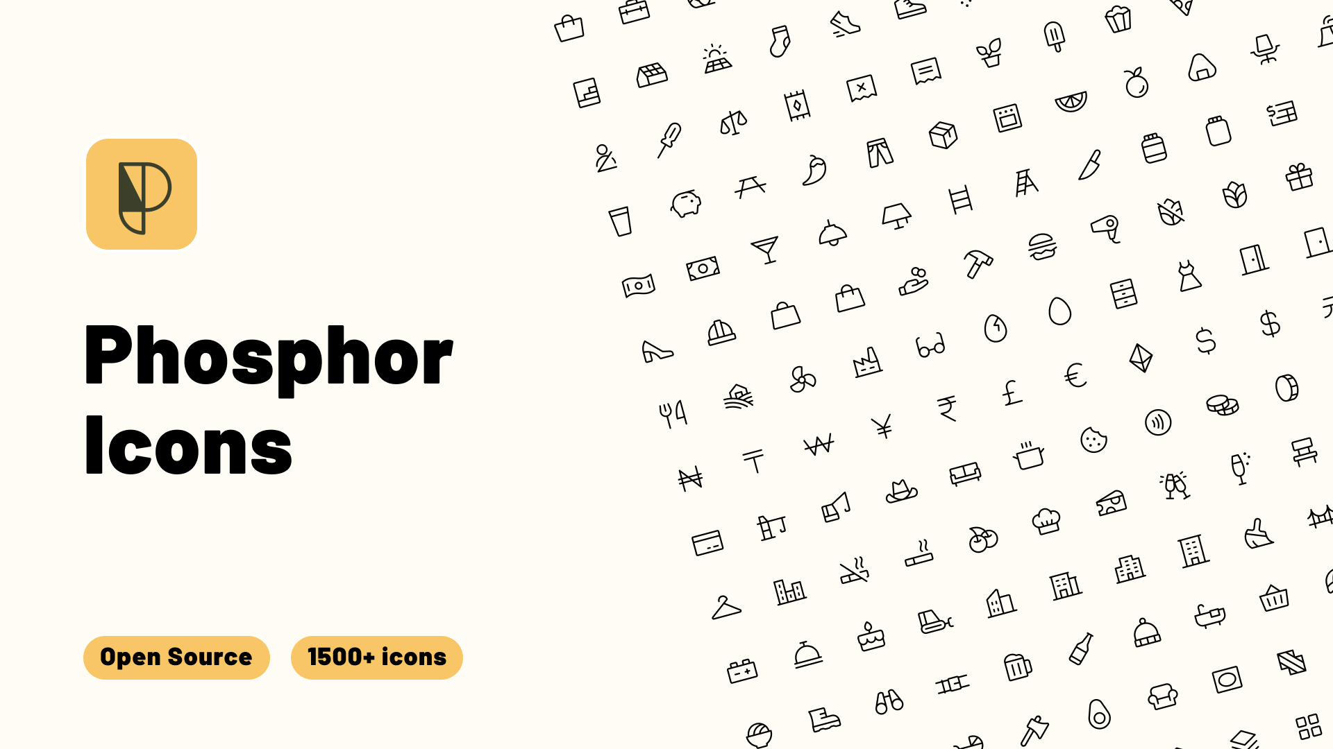
Image: Phosphor Icons Figma plugin (figma.com/community).
Lucide
Lucide is a very good option if the app needs a clean, minimal, modern SaaS look.
Its biggest strength is visual simplicity. The icons are light, consistent, and easy to fit into interfaces with a lot of whitespace, cards, lists, and simple navigation.
The main limitation is that Lucide does not have filled variants in the same way Material Symbols or Phosphor do. That matters if the app relies heavily on selected states or stronger visual hierarchy.
The other thing to keep in mind is that Flutter support is community-maintained. Lucide itself is popular and widely used, but the Flutter packages are not quite the same as using a first-party package from a large publisher.
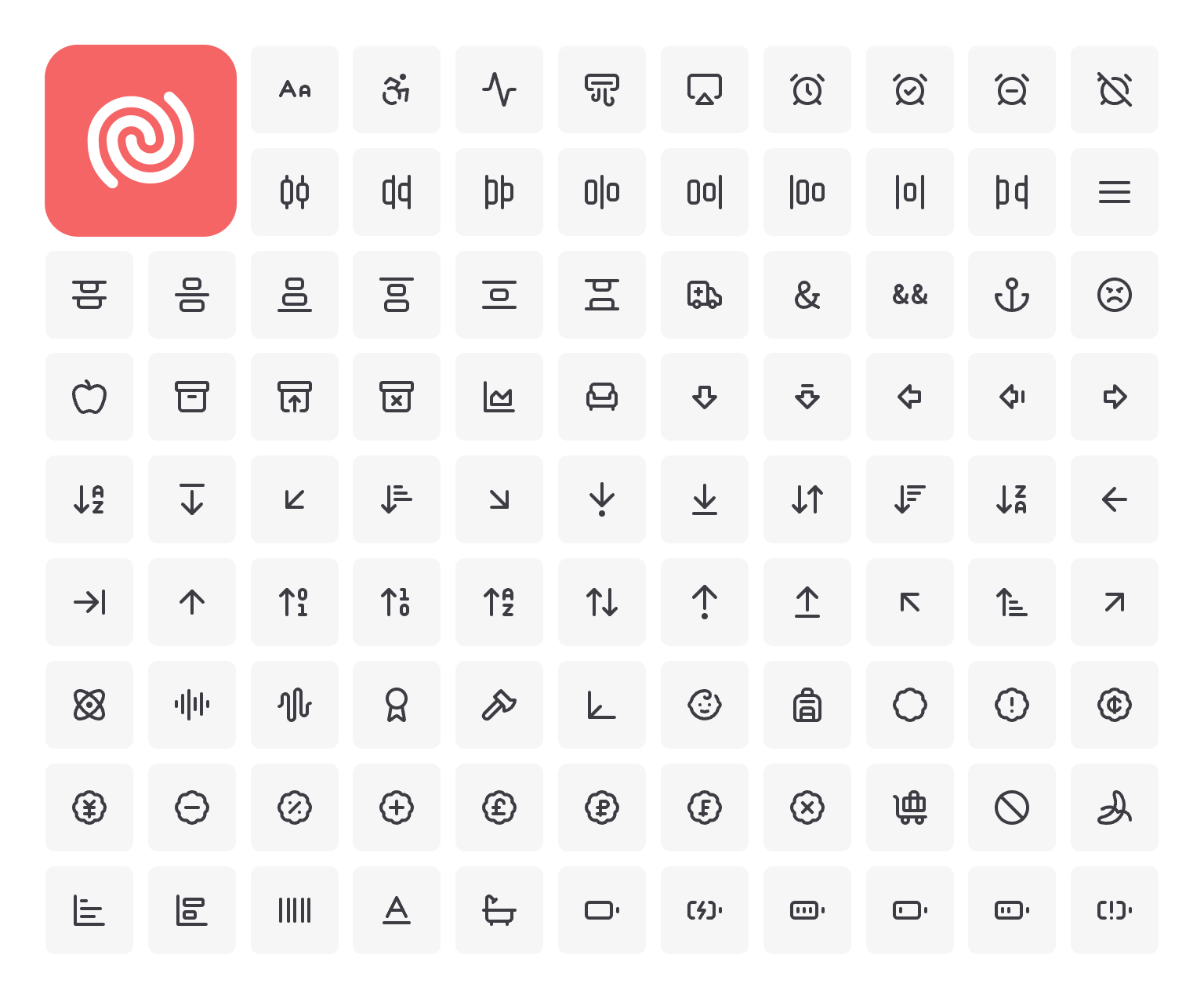
Image: Feather Icons preview via Publii docs (Lucide is a Feather fork; replace with a true Lucide screenshot when possible).
Fluent UI System Icons
Fluent UI System Icons are worth considering for enterprise apps, internal tools, dashboards, and Windows-adjacent products.
This is mostly about user habits. If people use your product in an environment full of Microsoft 365, Teams, SharePoint, Azure, or Windows-style internal tools, Fluent icons can feel familiar in a good way.
The package also has a strong trust signal because it is published by Microsoft.
I would not use Fluent icons for every custom Flutter app. For a consumer app or a highly branded mobile product, they may feel too enterprise. But for business software and Microsoft-heavy environments, they make a lot of sense.
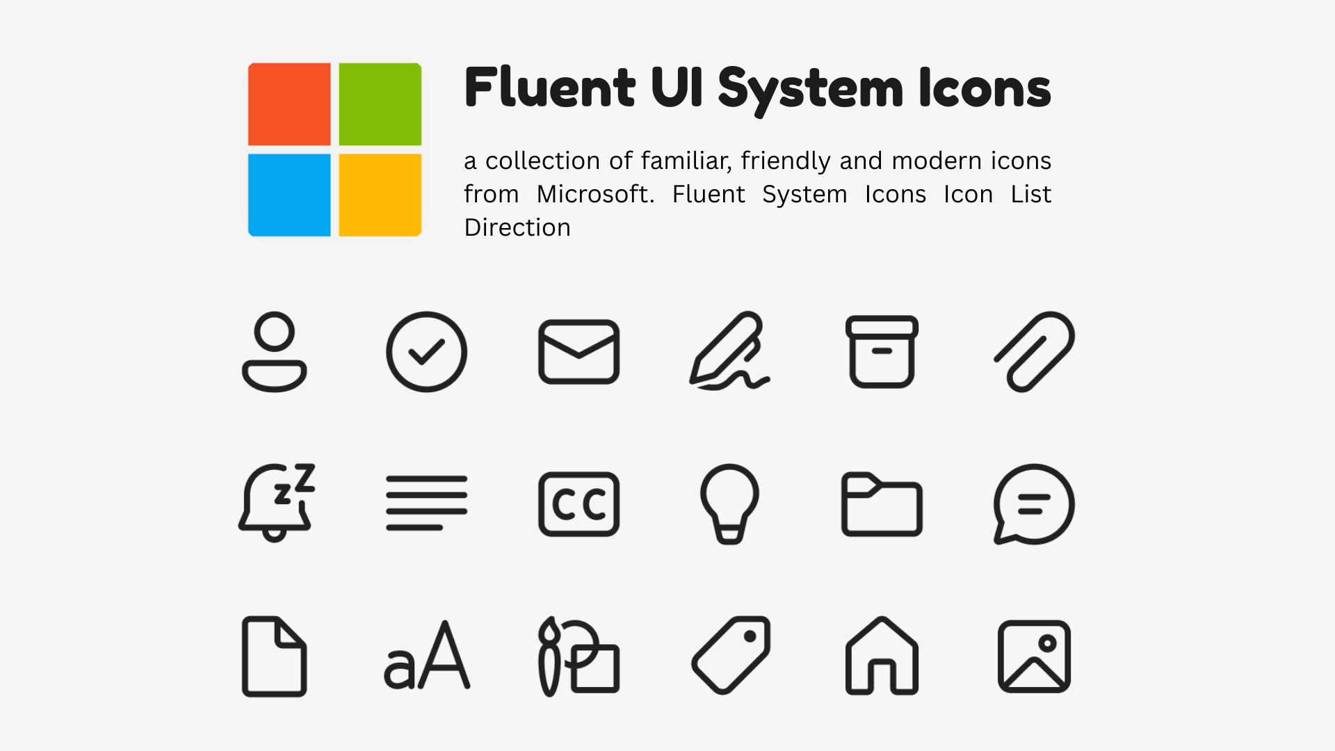
Image: Microsoft Fluent UI System Icons Figma plugin (figma.com/community).
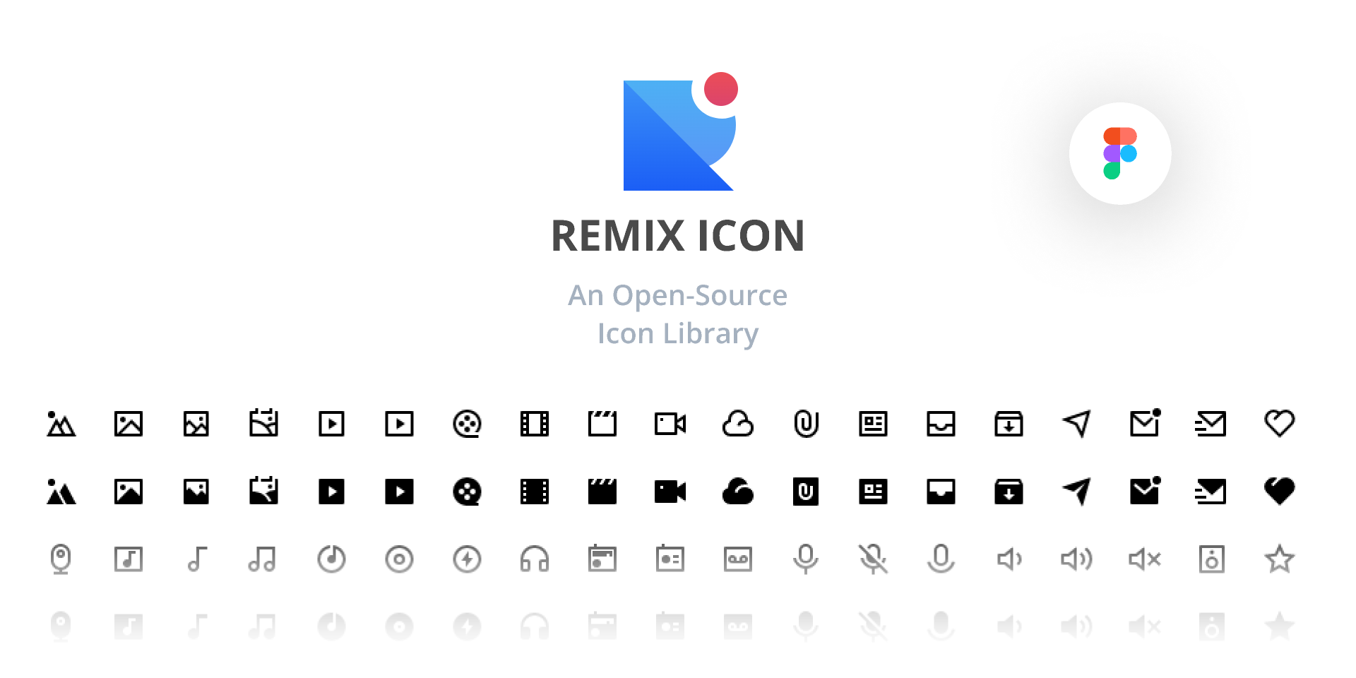
Remix Icons
Remix Icons are a good neutral option.
They do not feel as minimal as Lucide, as flexible as Phosphor, as platform-specific as Material Symbols, or as enterprise-specific as Fluent. That can be useful when you want clean product icons without too much personality.
Remix also has both line and filled icons, which makes it more practical than line-only sets for mobile navigation and selected states.
I would consider Remix for apps that need a general-purpose icon set but do not want to look too tied to Google, Microsoft, Apple, or a specific web design trend.
Image: Remix Icon Figma library (figma.com/community).
There are also other Flutter icon packages worth knowing like Font Awesome, Hugeicons, Bootstrap Icons and Eva Icons and Heroicons which you take a look at and make your own judgement.
What if the icon set you want does not have Flutter support?
Not every good icon set has good Flutter support.
This often happens when designers choose web-first icon sets. Maybe the design uses Tabler. Maybe it uses another SVG-based set from Figma. Maybe the company already has its own custom icons.
In that case, you usually have two practical options: use SVGs directly, or generate a custom icon font.
SVGs are the easiest path. They work well for custom icons, brand assets, multicolor icons, complex shapes, and one-off illustrations.
But for a production design system with normal monochrome UI icons, I usually prefer an icon font.
The API is cleaner. The icons behave more like normal Flutter icons. You can use them consistently across the app. And if the font is generated properly with static icon references, it can work well with Flutter’s icon tree shaking.
So the rule of thumb is simple:
- Use SVGs for complex, colorful, illustrative, or one-off assets.
- Use an icon font for simple UI icons that are part of the app’s design system.
Conclusion
Choosing an icon pack is not the biggest architectural decision in a Flutter app, but it is one of those small decisions that affects almost every screen.
A good icon set quietly supports the design system. It covers the product well, matches the visual direction, and does not force the team to mix styles every time a new feature needs a slightly specific icon.
The Material and Cupertino decoupling is a good reminder that these choices should be explicit. If the app is Material by design, Material Symbols makes sense. If the app has its own visual language, the icon set should be chosen with the same care as typography, spacing, colors, and components.
For most teams, the best starting point is still an existing icon set with good coverage, filled variants, and predictable tree shaking. If the product needs something more specific, a custom icon font is usually the cleaner long-term option than scattering individual SVGs everywhere.
The important part is to choose intentionally, because icons are not isolated assets. They become part of how the app feels.
If you have found this useful, make sure to like and follow for more content like this. To know when the new articles are coming out, follow me on Twitter and LinkedIn.